Web Resources
- CSSTricks : A Complete Guide to Flexbox
- MDN : CSS Flexible Box Layout
- A Visual Guide to Flexbox Properties
Flexbox CSS Properties
| Property Name | Description |
|---|---|
| The Flex Container | Defines a flex container that enables a flex context for all its direct children. |
display: flex; |
Defines the flex container as a block |
display: inline-flex; |
Defines the flex container as inline |
| Direction |
Establishes the main-axis, thus defining the direction that flex items are placed
in the flex container.
|
flex-direction: row; |
Default. Fills the flex container in row-priority order, from left to right.Depiction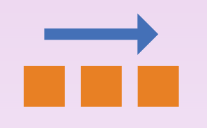
Live Example
Item 1
Item 2
Item 3
JSFiddle |
flex-direction: row-reverse; |
Fills the flex container in row-priority order, from right to left.Depiction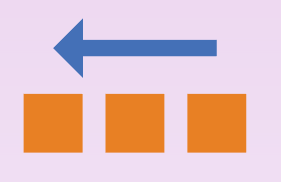
Live Example
Item 1
Item 2
Item 3
|
flex-direction: column; |
Fills the flex container in column-priority order, from top to bottom.Depiction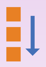
Live Example
Item 1
Item 2
Item 3
|
flex-direction: column-reverse; |
Fills the flex container in column-priority order, from bottom to top.Depiction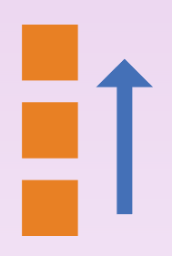
Live Example
Item 1
Item 2
Item 3
|
| Wrapping | Defines the behavior of the flex container when all items do not fit on one line |
flex-wrap: nowrap; |
Default. All flex items will be on one lineLive Example
Item 1
Item 2
Item 3
Item 4
Item 5
|
flex-wrap: wrap; |
Flex items will wrap onto multiple lines, from top to bottomLive Example
Item 1
Item 2
Item 3
Item 4
Item 5
|
flex-wrap: wrap-reverse; |
Flex items will wrap onto multiple lines, from bottom to topLive Example
Item 1
Item 2
Item 3
Item 4
Item 5
|
| Flex Flow Shortcut |
This is a shortcut property to set flex‑direction and flex‑wrap in one setting.
|
flex‑flow: |
The default is row nowrap. See above settings for examples.
|
| Content Justification | Defines the alignment of the items along the main axis |
justify-content: flex-start; |
Default. Items are packed toward the start of the line.Live Example
Item 1
Item 2
Item 3
Item 4
Item 5
|
justify-content: flex-end; |
Items are packed toward the end of the line.Live Example
Item 1
Item 2
Item 3
Item 4
Item 5
|
justify-content: center; |
Items are centered along the lineLive Example
Item 1
Item 2
Item 3
Item 4
Item 5
|
justify‑content: space‑between; |
Items are evenly distributed in the line; The first item is on the start line, last item is on the end line.Live Example
Item 1
Item 2
Item 3
Item 4
Item 5
|
justify-content: space-around; |
Items are evenly distributed in the line with equal space around them.NotesItems in the middle have twice as much space as the space to the left of the first item, and to the right of the last item. This is because each item has the same space to the left and right, meaning items in the middle will have double the space. Live Example
Item 1
Item 2
Item 3
Item 4
Item 5
|
justify-content: space-evenly; |
Items are distributed so that the spacing between any two items is equal.Live Example
Item 1
Item 2
Item 3
Item 4
Item 5
|
| Item Alignment | Defines the default behavior for how flex items are laid out along the cross axis |
align‑items: stretch; |
Default. Stretch to fill the container (but still respect
|
align‑items: flex‑start; |
|
align‑items: flex‑end; |
|
align‑items: center; |
Items are centered in the
|
align‑items: baseline; |
Items are aligned such as their baselines align
Item 1
Item 2
Item 3
Item 4
Item 5
|
| Item Self Alignment |
Allows the default alignment specified by the align‑items setting to be overridden
for individual flex items.
|
align‑self: auto; |
Default. Use the flex container's
|
align‑self: flex‑start; |
|
align‑self: flex‑end; |
|
align‑self: center; |
Items are centered in the
|
align‑self: stretch; |
Stretch to fill the container (but still respect min-width/max-width)
Item 1
Item 2
Item 3
Item 4, Align Self =
stretch
Item 5
|
align‑self: baseline; |
Items are aligned such as their baselines align
Item 1
Item 2
Item 3
Item 4, Align Self =
baseline
Item 5
|
| Content Alignment |
Similar to justify-content, but applies to the cross-axis instead of the main-axis.
Has no effect when there is only 1 row of items.
|
align-content: stretch; |
Default. Lines stretch to take up the remaining space.
Item 1
Item 2
Item 3
Item 4
Item 5
|
align-content: flex-start; |
Lines are packed to the start of the container.Live Demo
Item 1
Item 2
Item 3
Item 4
Item 5
|
align-content: flex-end; |
Items are packed toward the end of the container.Live Demo
Item 1
Item 2
Item 3
Item 4
Item 5
|
align-content: center; |
Lines are packed to the center of the container.Live Demo
Item 1
Item 2
Item 3
Item 4
Item 5
|
align‑content: space‑between; |
Lines are evenly distributed. The first line is at the start of the container while the last one is at the endLive Demo
Item 1
Item 2
Item 3
Item 4
Item 5
|
align-content: space-around; |
Lines evenly distributed with equal space around each line.Live Demo
Item 1
Item 2
Item 3
Item 4
Item 5
|
| Item Ordering | Controls the order that items are laid out in the container. |
order: <integer>; |
The order of the itemLive Demo
Item 1, Order 2
Item 2, Order 3
Item 3, Order 1
Item 4, Order 5
Item 5, Order 4
|
| Item Growth | Defines how extra space in the flexbox shall be distributed among the flex items. It accepts a unitless parameter that serves as a proportion. |
flex-grow: <integer>; |
The growth parameter, as a proportion. The default is 0.Notes
VideosLive Demo
Grow 1
Grow 2
Grow 3
Grow 2
Grow 1
|
| Item Shrinkage | If there is not enough space in the flexbox to accommodate all of the desired widths of the flex items, this parameter controls how space will be taken from each flex item to shrink them down to fit the space. It accepts a unitless parameter that serves as a proportion. |
flex-shrink: <integer>; |
The shrinkage parameter, as a proportion. Default is 1.Notes
Live Demo
Grow 1
Grow 2
Grow 3
Grow 2
Grow 1
|
| Item Basis |
Specifies the initial (desired size) of the flex item. The item may grow or shrink from this value. See
flex‑grow and flex‑shrink for examples.
|
flex‑basis: <specific-value>; |
Specify the desired size in ordinary CSS units (px, em, etc.) |
flex‑basis: auto; |
The default. The flex item is automatically sized, and grows or shrinks as specified by
flex‑grow and flex‑shrink
|
flex‑basis: fill; |
Property listed on MDN. No other information is available. |
flex‑basis: max‑content; |
Property listed on MDN. No other information is available. |
flex‑basis: min‑content; |
Property listed on MDN. No other information is available. |
flex‑basis: fit‑content; |
Property listed on MDN. No other information is available. |
flex‑basis: content; |
Property listed on MDN. No other information is available. |
flex‑basis: inherit; |
Inherits this property from its parent element. |
flex‑basis: initial; |
Sets this property to its default value. |
flex‑basis: unset; |
Property listed on MDN. No other information is available. |
Other Notes for flex‑basis |
The details for this property are a bit sketchy. The flexbox specification has had a few changes from its original version, and as
such, some articles on the Internet mention properties and values that are now deprecated, and/or fail to mention newer settings.
The Mozilla Developer Network references several possible values for this property that are not mentioned in other resources, but does
not provide any additional documentation. W3Schools only mentions auto, initial, and inherit, along
with setting a specific unit value.
|
| Flex Shortcut |
The flex property allows a shortcut for setting flex‑grow, flex‑shrink, and
flex‑basis with a single setting. This is the preferred method.
|
flex: none; |
Same as flex: 0 0 auto;
|
flex: <flex‑grow>; |
If only one value is specified, it is taken as the flex‑grow setting. However,
it is recommended to give all 3 values.
|
flex: <flex‑grow> <flex‑basis>; |
IF only two values are specified, they are taken as the flex‑grow and flex‑basis settings.
|
flex: <flex‑grow> <flex‑shrink> <flex‑basis>; |
This is the recommended form of the flex setting. If not specified, it defaults to flex: 0 1 auto;.
|